Video is wonderful at providing that visceral and emotional impact necessary to engage anyone in a social cause. That visual punch works best if it’s up front where it can capture people and pull them into the text, links and other images that make up a truly useful tapestry of content. My favorite example of this is The Girl Effect, a website that so seamlessly incorporates video that you don’t even notice when you’re watching the video and when you’re visiting the website. With this level of integration you start to enhance the power of a video and consequently the rest of the site.

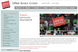
Another thing I’ve noticed is that spreading video throughout a website is an amazing way to bring things to life. Not every page has to contain a slickly edited piece, but simply having that visual reference in every area is powerful. Now you’re not only providing content for the visual learners out there (those who learn through reading) but also for the auditory learners too (those who learn through listening and watching). One of our clients provides a clear and powerful example of this. The Urban Justice Center not only put their video in the center of their homepage but took little snippets about each of their projects and put them on the project pages. All of a sudden the site has faces and voices and that elusive quality of “people” that can evade us when we let video and websites remain distant cousins.


No comments:
Post a Comment